我们在使用Excel对进行数据的储存和管理的时候,单纯的文字数字总是会让我们的视觉出现疲惫,我们经常会使用到扇形统计图来缓解这一问题,通过扇形统计图我们可以非常直观的看出不同数据的占比,快速帮我们对数据内容有个大概了解。那么怎么使用Excel制作扇形统计图呢?下面小编就带着大家来学习一下吧!
使用Excel 2010制作扇形统计图具体步骤:
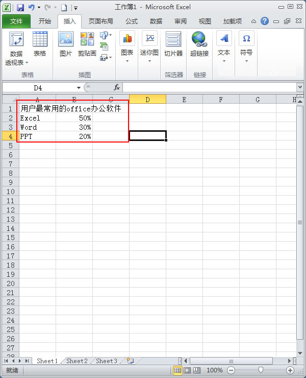
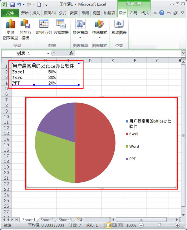
1、首先在Excel中输入表的名称和数据。如下图所示;
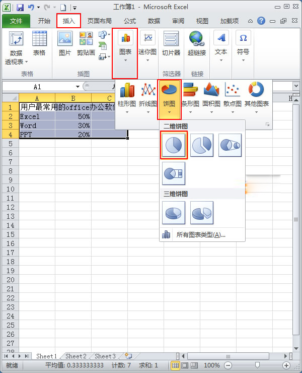
2、鼠标选中数据表格,切换到【插入】选项卡,单击【图标】选项组,在下拉面板中选择【饼图】—【二维饼图】;
3、Excel系统就自行根据数据建立好了一个饼图;
4、给统计图上添加标签文字说明。在饼图上单击鼠标右键,在弹出的快捷菜单中选择【添加数据标签】;
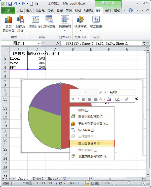
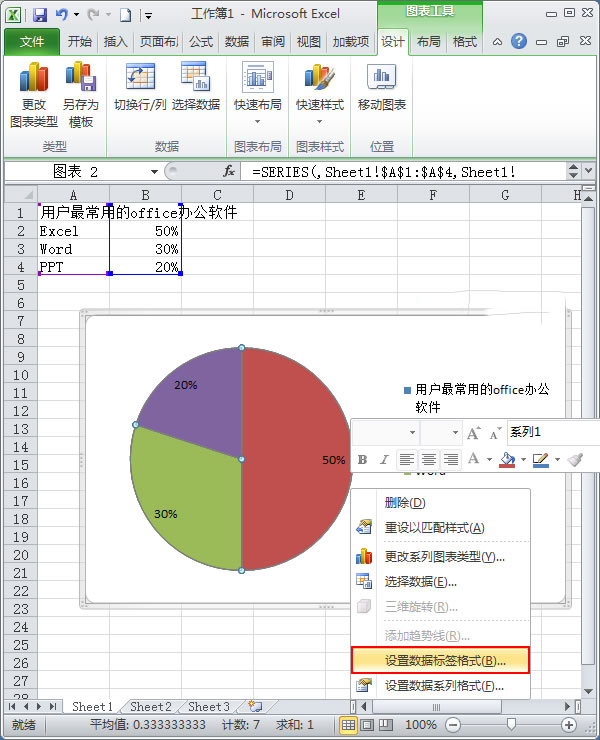
5、我们发现图上添加了百分比显示,再次单击右键,在弹出的快捷菜单中选择【设置数据标签格式】;
6、在弹出的对话框中切换到【标签选项】,勾选【类别名称】,完毕后单击【关闭】;
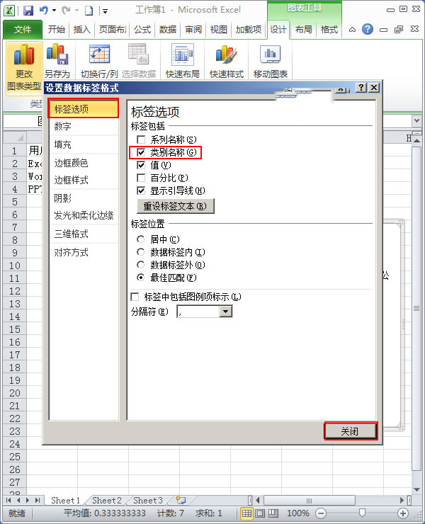
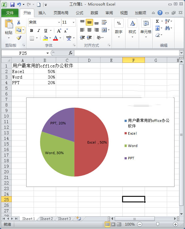
7、这样一个扇形统计图就做好了。效果如下图,在饼图中还有三维饼图,那种是用作有数据交叉的时候。有兴趣可以去尝试一下;